Documentation Index
Fetch the complete documentation index at: https://docs.mattildapayments.com/llms.txt
Use this file to discover all available pages before exploring further.
Overview
The outer styling (any containers around fields, etc) is completely in your
control. Secure Fields will also generate classes along with a set of data
attributes and attach them to the outer <iframe> containers, so you can target
them with your own CSS. Finally, an object of CSS rules can be passed to the
addCardNumberField, addExpiryDateField and addSecurityCodeField methods
options to style elements inside the frame(s).
Usage
To customize a field, you can pass an Object containing some Options
Any options will override the defaults.
secureFields.addCardNumberField({
  placeholder: "Enter card number",
  styles: {
    color: "black",
    fontSize: "18px",
    ":focus": {
      color: "blue",
    },
  },
});
Options
Placeholder
A placeholder text for the field can be added as a string
{
  placeholder: "Enter card number";
}
Styles
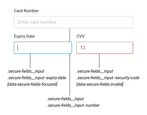
Each secure input is wrapped with a div, which you can target with your own CSS
using the following selectors:
/* Applied to each field */
.secure-fields__input {
}
/* Applied to the card number field */
.secure-fields__input--number {
}
/* Applied to the expiry date field */
.secure-fields__input--expiry-date {
}
/* Applied to the security code field */
.secure-fields__input--security-code {
}
/* Applied to a focused field */
.secure-fields__input[data-secure-fields-focused] {
}
/* Applied to an invalid field */
.secure-fields__input[data-secure-fields-invalid] {
}
/* Applied to an autofilled field */
.secure-fields__input[data-secure-fields-autofilled] {
}
styles Object this way:
- Base styles are declared by setting keys in
camelCase format (PascalCase
for vendor-prefixed properties) and values as strings
- Hover, focus and other states are declared by setting keys to
:[state] (e.g.
:hover) and values as objects containing base styles
const styles = {
  // Default styles (any of the supported CSS property)
  color: ...,
  // Rules applied when the field has its value autofilled by a browser / extension
  ':autofill': { ... },
  // Rules applied when the field is hovered
  ':hover': { ... },
  // Rules applied when the field is focused
  ':focus': { ... },
  // Rules applied when the field is disabled
  ':disabled': { ... },
  // Rules applied when the field is valid
  ':valid': { ... },
  // Rules applied when the field is invalid
  ':invalid': { ... },
  // Rules applied to the field placeholder
  '::placeholder': { ... },
}
backgroundColor;
boxShadow;
caretColor;
color;
colorScheme;
cursor;
font;
fontFamily;
fontFeatureSettings;
fontKerning;
fontSize;
fontSizeAdjust;
fontStretch;
fontStyle;
fontVariant;
fontVariantAlternates;
fontVariantCaps;
fontVariantEastAsian;
fontVariantLigatures;
fontVariantNumeric;
fontVariationSettings;
fontWeight;
letterSpacing;
lineHeight;
opacity;
padding;
textAlign;
textShadow;
textRendering;
transition;
MozOsxFontSmoothing;
WebkitFontSmoothing;
Logos
A scheme logo can be displayed to the customer as part of the user experience.
This is possible by listening to the cardNumberField and displaying the appropriate scheme logo.
Refer to payment_method.scheme for the full list of schemes.
The logos can be loaded via https://api.mattildapayments.com/assets/icons/card-schemes/<scheme>.svg
Refer to card scheme definitions for more information around the schemes and logos.
cardNumberField.addEventListener('input', function(evt) {
  if (evt.schema && evt.schema === "visa") {
    //change logo where appropriate
  }
});